Snapper Script Wilcom ESA Font
$24.95

A one-time price of $24.95 will be added to your order.


- Description
I was bored and had nothing else to do, so I made up yet another script font, based on the Snapper one. Personally, I totally hate it when the caps for the letters "I" and "T" look funny, so I changed those to suit myself. Because I can.
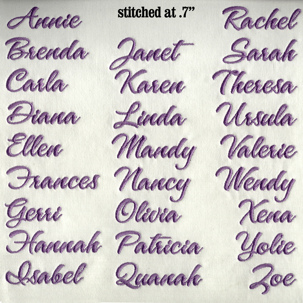
I stitched out the full array of letters and punctuation at 1" height, but then did the names list in a size of .7" so you can see how they go together. Since we have the thick/thin issue going on here, it's probably best to not go smaller than that. Or, at least test them first at a smaller size. Your mileage may vary.
For Wilcom users running version 8 and above.